
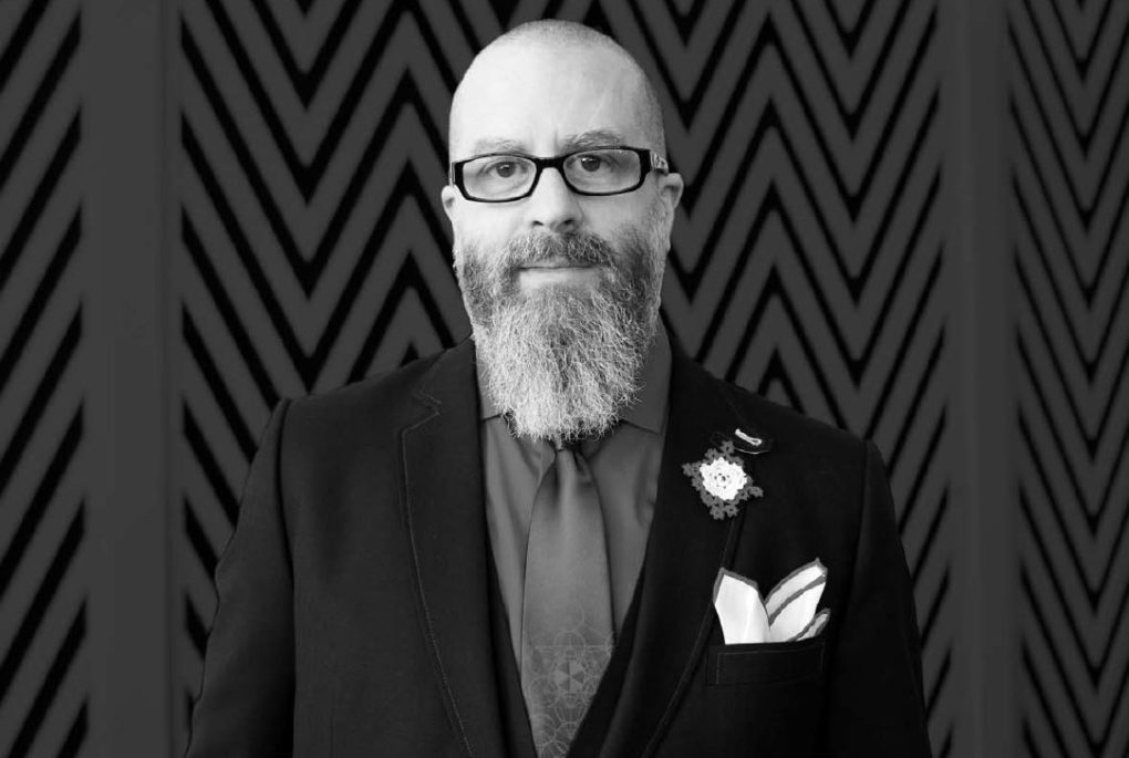
“I was fortunate to be exposed to a wide range of comics and genres at an early age, and that fed into my young life decision to become a comic book artist. I think I made that choice when I was 8 to 10 years young and pretty much had a one-track mind ever since. It sort of set the stage for being open to what comics can be as I grew older.”
(Prologue: This interview was conducted 6 years ago back in 2014 and was originally featured in print issue #37.)
JH Williams III is the best comic book artists currently working in the medium. Need proof? Pick up the latest issue of The Sandman: Overture (available at finer comic book shops everywhere) or anything else he’s ever produced. After considerable cajoling and a few helpful guiding questions, Ghettoblaster pulled him away from his drawing table long enough to bring you this installment of What’s On Deck. Here he tells us what the most talented of illustrators does while not hard at work blowing comics readers’ minds.
Who are some of your favorite artists and why?
There are so many great artists past and present that I find highly intriguing, so it really depends on what I’m exposed to at any given moment. I tend to scrutinize and analyze whatever art is in front of me in such a way that I can’t help but find things that I admire about what I’m seeing. I’ll find different aspects that I can appreciate in just about every artist’s work. With that said, I do have some that will always impact my life—Jack Kirby, Moebius, Michael Golden, the Hernandez brothers, Monet (any of the great impressionists really), Gustav Klimt, Howard Pyle, Andy Warhol, Peter Max—the list could go on indefinitely, probably.
What’s your favorite museum to visit anywhere in the world?
Maybe the Museum of Geology at the School of Mines and Technology in South Dakota, or perhaps the Indian Museum of North America at Crazy Horse Memorial, also in South Dakota. Or, when it was still open, The Liberace Museum in Las Vegas, Nevada.
What type of music are you currently listening to?
I pretty much listen to all types of music; nothing is off-limits. Either it resonates with me or it doesn’t. Recently I listened to The March Violets’ Made Glorious double CD version. Tremendously good. Before that, I was listening to Baroness’ Yellow and Green on vinyl. Excellent. And just picked up the remastered double-disc of Etiquette of Violence by David J. Been a David J fan forever. Picked up the following on vinyl—Fuzz, Hank III’s Brothers of the 4×4, and the limited edition of Explosions in the Sky’s Take Care, Take Care, Take Care.
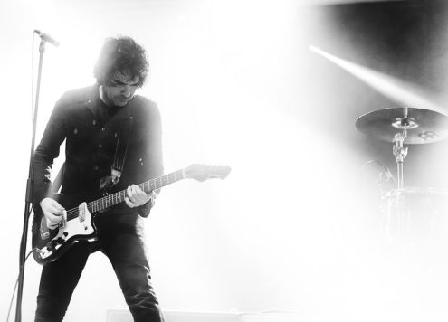
What was your favorite concert of late?
Unfortunately, being so busy has made concertgoing become a rare thing. So, since it has become rare, I can’t really say I have a favorite show; I tend to thoroughly enjoy each one. Last year we saw The Sword, Blondie with Devo and Acid Velvet Christ. Really fantastic shows. We just bought Nick Cave tickets, so very eager to see him.
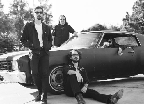
You’ve drawn some album covers—most recently the Blondie cover. Is that something you’ve wanted to do?
Yeah, I’ve always really enjoyed the visuals on album art. Well, the ones that weren’t just nicely designed photography that is. In the past the offers sometimes wouldn’t work out for me, usually due to schedule conflicts or the money wasn’t there for the amount of work involved. That was until The Sword reached out to me. I was already a fan of theirs when I got an email from their manager. Turns out they were into my work. So we started talking, and the schedule was the right fit. The result was all of the package design for Apocryphon. The process is definitely different than comics. With The Sword it involved a sharing of ideas, discussing the themes of this album, how it related to or didn’t relate to the previous release by them. What the lyrical content meant. The album’s symbolism played a large role in the art presented, connecting and creating meaning in large esoteric strokes.
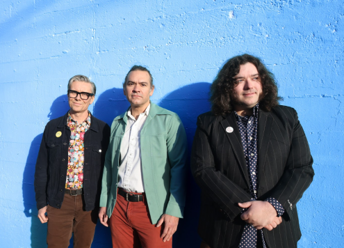
I think the process for this type of work differs from band to band. For example, the Blondie project happened from a chance meeting with them at one of their shows. I had brought them a book I had done as a gift. They had time to look through it and really dug it. I just blurted out, “If you need an artist…” and Chris Stein paused for a second or so, then said, “The next cover.” To say I was over the moon is an understatement of massive proportions. I’ve been a rabid Blondie fan my entire life. The first record I ever bought with my own money was Blondie’s Atomic 45 single. Long story short, we got to talking, and by the time the new music was ready Chris and I had built a bit of a relationship to such a degree that he really relied on whatever it was I wanted to do. So almost all of the packaging design for Ghosts of Download was trusted to me; they had confidence I would bring something different to them. They wanted my vision like The Sword had, but instead of focused conversations, it was them saying they want me to do this how I see it entirely. My wife and I even helped them brainstorm the album title! I also was contacted by someone from the Wu-Tang Clan, but it didn’t work out for whatever reason. That would’ve been an extraordinary project to do. So that brings us back to comics and to Sandman in particular.
I know music has had a large impact on Neil [Gaiman]. And in some ways, the work he’s done in Sandman over the decades has music in its bones. It might not be immediately obvious to some, because the material is also influenced by the literary, but it is there. So in some ways, Sandman: Overture and many of my other projects live in music as much as they do in comics. There is this sense of operatic feel to the pacing movements I try to bring into the sequential work. I’m not sure if others can see it, but that is a bit of what I’m after.
What comics did you grow up reading? Did you always want to be a comic book artist?
I had read a lot of Marvel comics as a kid, only a little bit of DC. Also, whatever small publisher stuff I would come across. European comics as well. I was fortunate to be exposed to a wide range of comics and genres at an early age, and that fed into my young life decision to become a comic book artist. I think I made that choice when I was 8 to 10 years young and pretty much had a one-track mind ever since. It sort of set the stage for being open to what comics can be as I grew older. This definitely has played a role in having a wide variety of tastes in my adult life. And I think that clearly shows in my own work’s diversity.
What do you like to do in SF on the weekend/in your free time?
Free time? What is that? Kidding (sort of). When not drawing, painting, designing, or writing I like to spend time with my wife as much as possible, watch films or read. I read a lot, actually, a lot of different things. Reading Philip K. Dick at the moment. I also try to get out for a bit each week to see friends.
You’ve designed clothes for a local store. What was that like?
To be clear, the clothing itself is designed by Artful Gentleman. I created for them a one-of-a-kind exclusive textile design silk lining for suit jackets and vest backs. But I think there are plans to use it in some other unique ways as well. The result of the design piece when matched to the fine work Artful Gentleman does is powerful, visually bold. It doesn’t play it safe in terms of asking for your attention, and good fashion should be making statements like that. It was an exhilarating experience to see it come down the runway at a San Francisco fashion show, marching past the audience to the music of Blondie, of course. It looked good next to every other extraordinary piece Artful Gentleman created. So I’m excited to do more as soon as possible.
How do you see color with your art in comics?
The color adds to the emotional impact, the atmosphere desired for a scene or sequence of scenes. To not think in these terms, I feel, is a mistake if the planned work is to be printed in color. Comics stories are essentially a visual medium first, so the impact of the art needs to feed what the story is trying to do or say, and color plays a very significant role in this. It’s a tool to enhance the emotionality, and fortunately for me I work with the best colorist in the business, Dave Stewart. He and I will communicate very closely on the intentions of the scenes, what I need to see the color doing, and he is a master at capturing this. He understands that I’m thinking about the color well ahead but without imposing on his own sensibilities. We approach the work as a team. But at the same time, the art itself needs to work and function perfectly well in black and white also. It’s important for the work to stand up without color as much as with it. Certainly, both bring out different aspects of the visual form, but if the ink work and painted washes work is completely reliant on color, then something is off for me. I need for it to feel complete without color first. So when color is added it enriches the experience in a different way.
Intro: Kris Poland
Social Media